The Dashboard
The dashboard is your main view of the current crop season. It brings together all monitored locations for a selected crop and region, giving you a high-level read on where risk stands and which areas require attention.
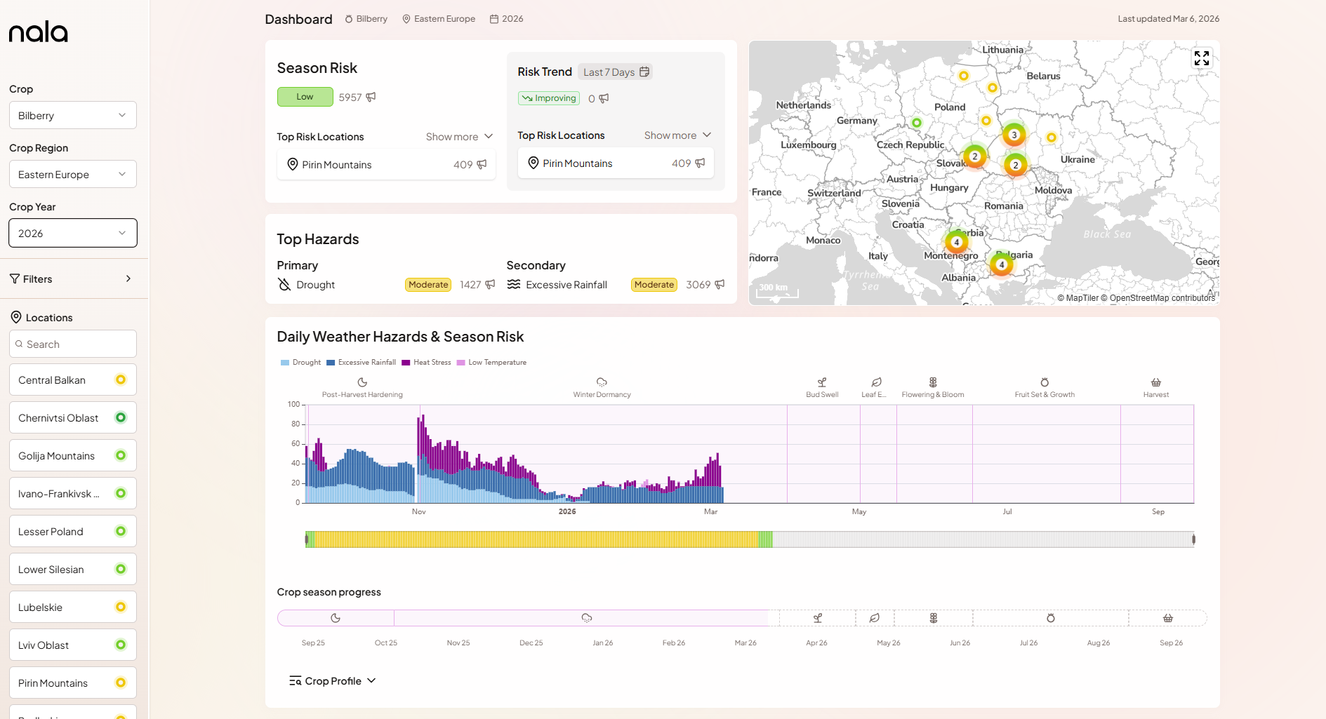
Selecting your crop, region, and year
Use the Crop and Crop Region dropdowns at the top of the dashboard to select what you want to monitor. The Crop Year dropdown lets you navigate to past seasons - historical seasons use the same methodology and can be a useful reference when comparing the current season against years you know were particularly stressful.
All dashboard components update to reflect your selection.
Location search
The Locations panel on the left lists all monitored locations with a colour-coded risk indicator. You can search by name to quickly find a specific location. Selecting a location in this panel highlights it on the map and scrolls the locations table to it.
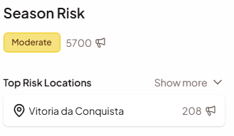
Season Risk
The Season Risk card shows the overall risk level and score for the selected crop and region at a glance. The colour-coded badge (VL to VH) and numerical score (0-100) reflect the current season's accumulated weather stress compared to the historical baseline. Below the score, the card lists the top risk locations - the individual monitored locations with the highest current risk.
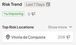
Risk Trend
The Risk Trend card shows how much the Season Risk Score has changed over a recent period. The default window is the past seven days, but it can be adjusted using the selector on the card. A "Worsening" indicator means conditions have deteriorated relative to historical norms; it also shows which locations have seen the largest recent increases. This helps you distinguish between a stable situation and one that is actively moving in the wrong direction.
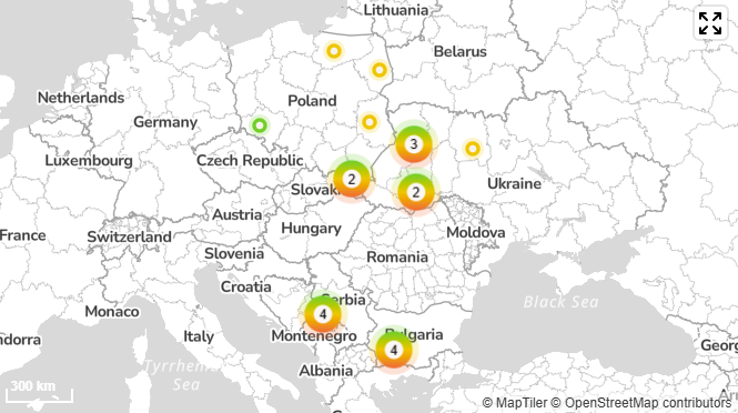
Map
The map shows all monitored locations for the selected crop and region geographically. Each location is marked with a colour-coded dot corresponding to its current Season Risk level, giving you a spatial sense of where stress is concentrated. Click any location to navigate to its detail view.
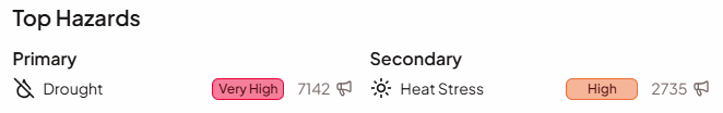
Top Hazards
The Top Hazards card highlights the primary and secondary weather stressors currently driving risk across all locations. Hazards are ranked by their average risk score across all monitored locations. This tells you not just that risk is elevated, but what kind of weather is driving it - whether drought, heat, frost, or excessive rainfall.
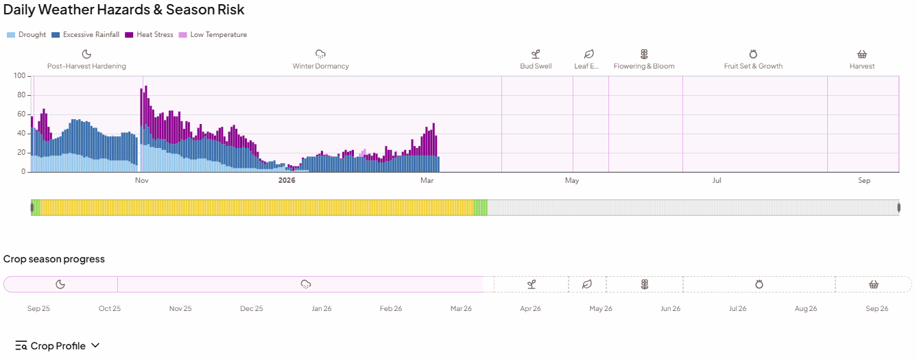
Weather Hazards & Season Risk chart
The main timeline chart shows the full history of hazard alerts across the current season. Daily bars are stacked and colour-coded by hazard type, so you can see both the volume of alerts and which stressors were active on any given day. The Season Risk ribbon below the chart shows how the overall risk level has evolved day by day.
The crop season progress bar at the bottom of the chart shows where the current date falls within the crop cycle and marks the phase boundaries.
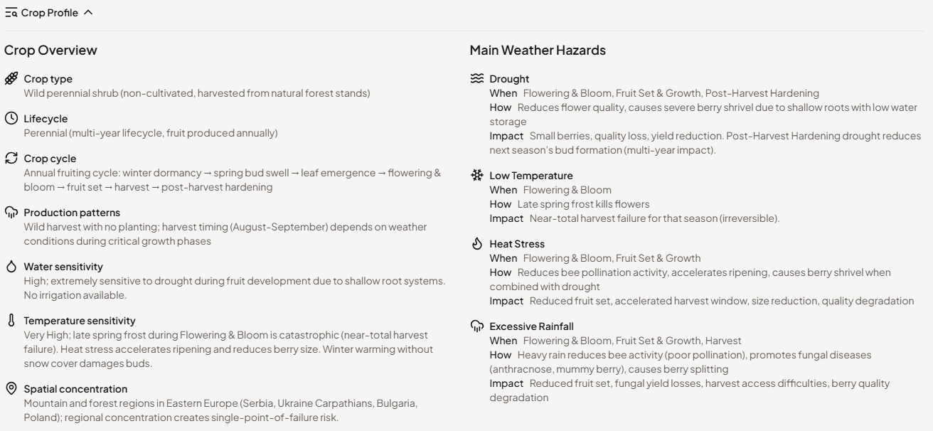
Crop Profile
Expanding the crop season progress bar opens the Crop Profile - a built-in agronomic reference for the selected crop. It contains two things:
The phase calendar lays out the full growing season phase by phase - from establishment or dormancy through to harvest - with the calendar dates for each phase at the monitored region. This gives you immediate context for what stage of the season you are looking at and what comes next.
The main weather risks section describes what each hazard type means for this specific crop: which phases are most sensitive, what kind of damage is caused by heat, frost, drought, or excessive rainfall, and how severe the impact tends to be. This is written in plain language, not in meteorological terms.
The Crop Profile is particularly useful when monitoring a crop your team is less familiar with, or when onboarding a new colleague to the platform. Rather than needing to know the agronomy upfront, users can open the profile directly alongside the risk charts to understand why an alert matters at a given moment in the season.
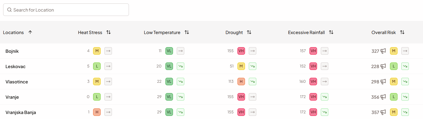
Locations table
The Locations table at the bottom of the dashboard gives you a systematic, side-by-side comparison of risk across every monitored location. For each location, the table shows the overall Season Risk level and trend, plus a per-hazard breakdown with three columns for each of the four hazards: the weighted alert total for the season (Critical = 2, Warning = 1), the Season Risk score for that hazard, and its risk trend. You can search by location name and sort by any column. Click a row to open the full Location View for that location.
What to look for: locations that are rated High or Very High across multiple hazards simultaneously are the most important to investigate further. A single elevated hazard may be manageable in isolation; two or more co-occurring at high severity is a signal that warrants close attention and, potentially, direct supplier contact.